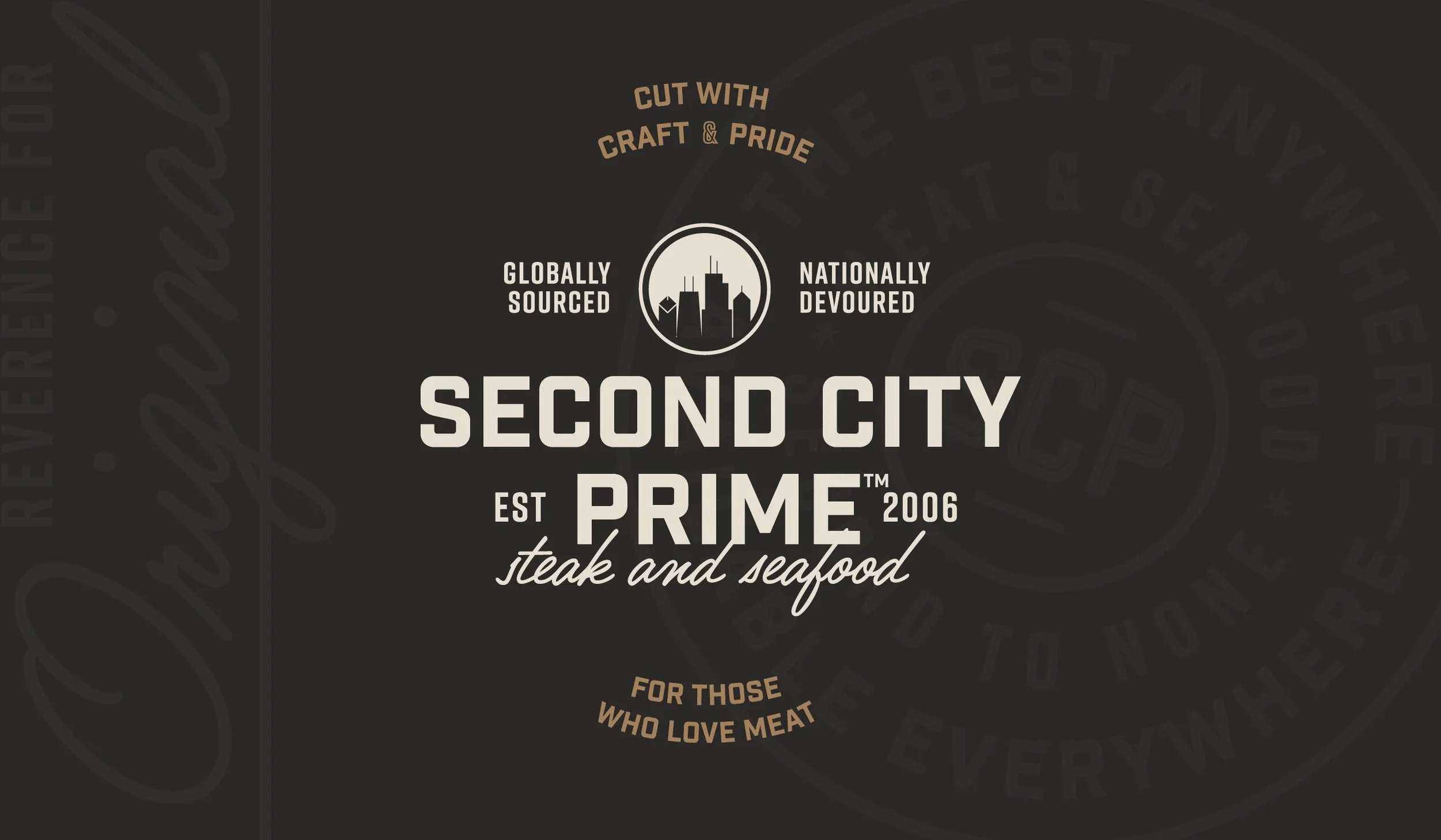
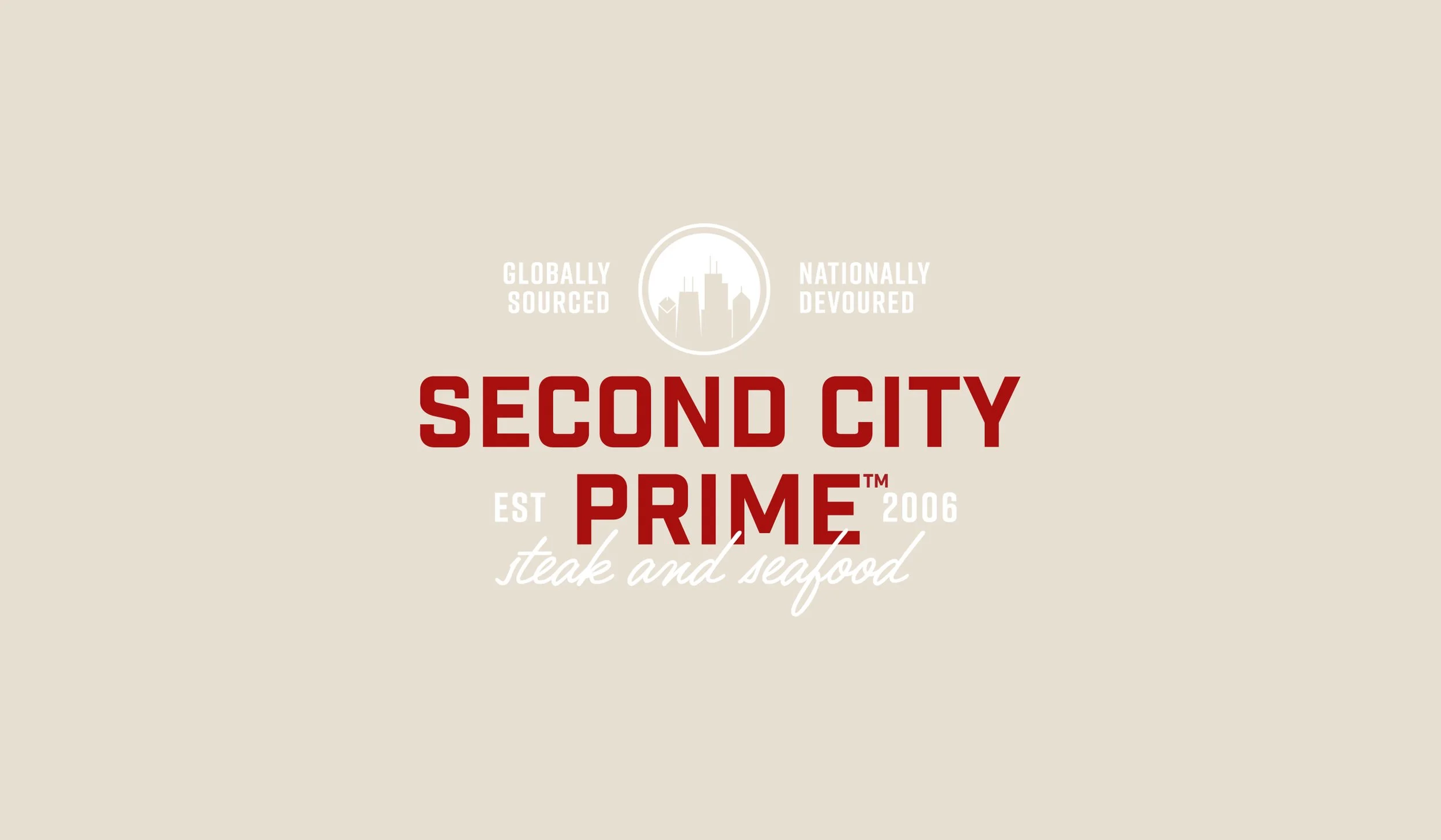
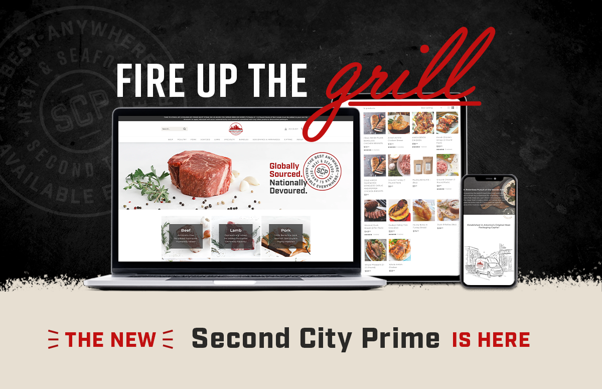
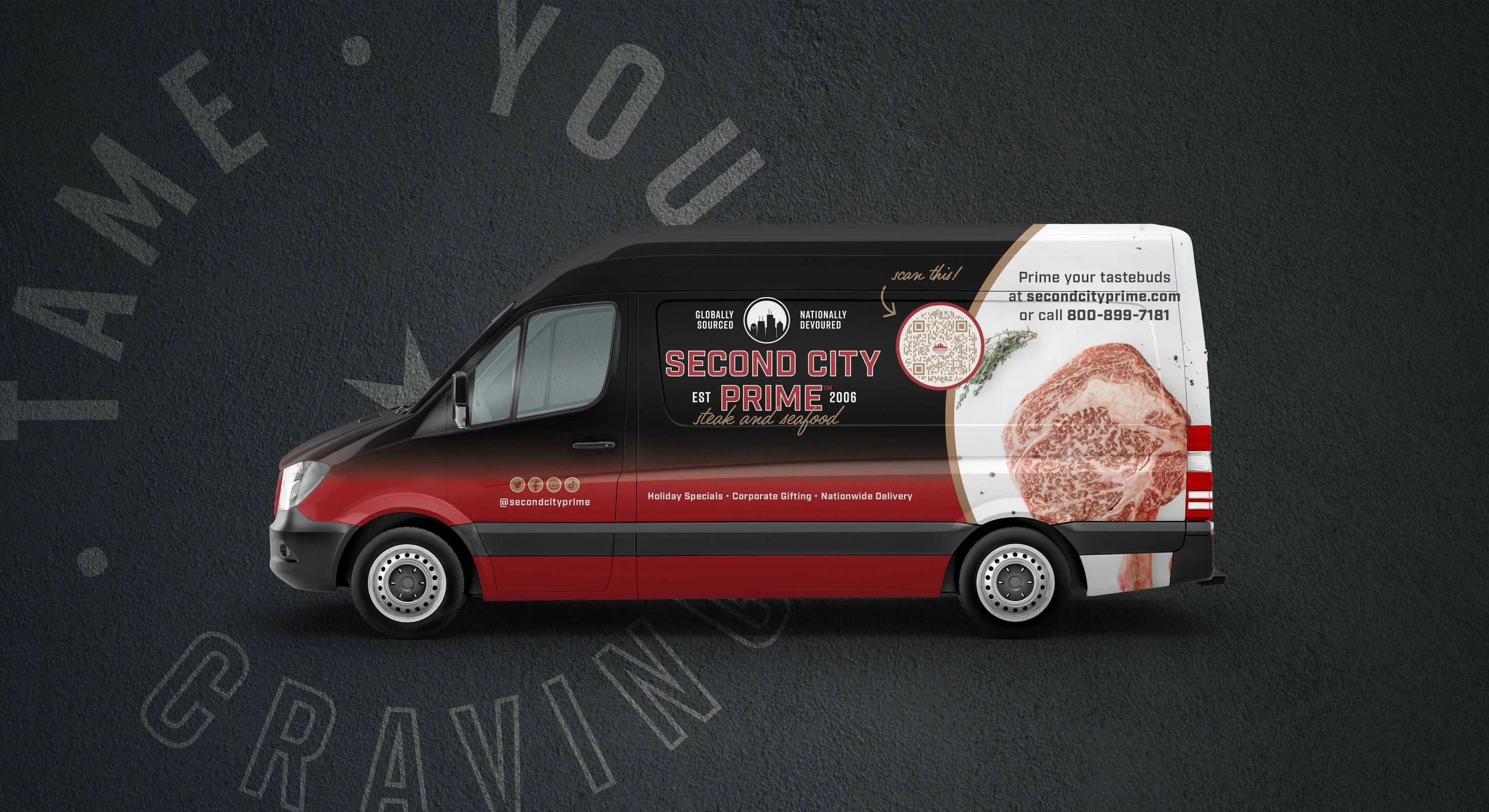
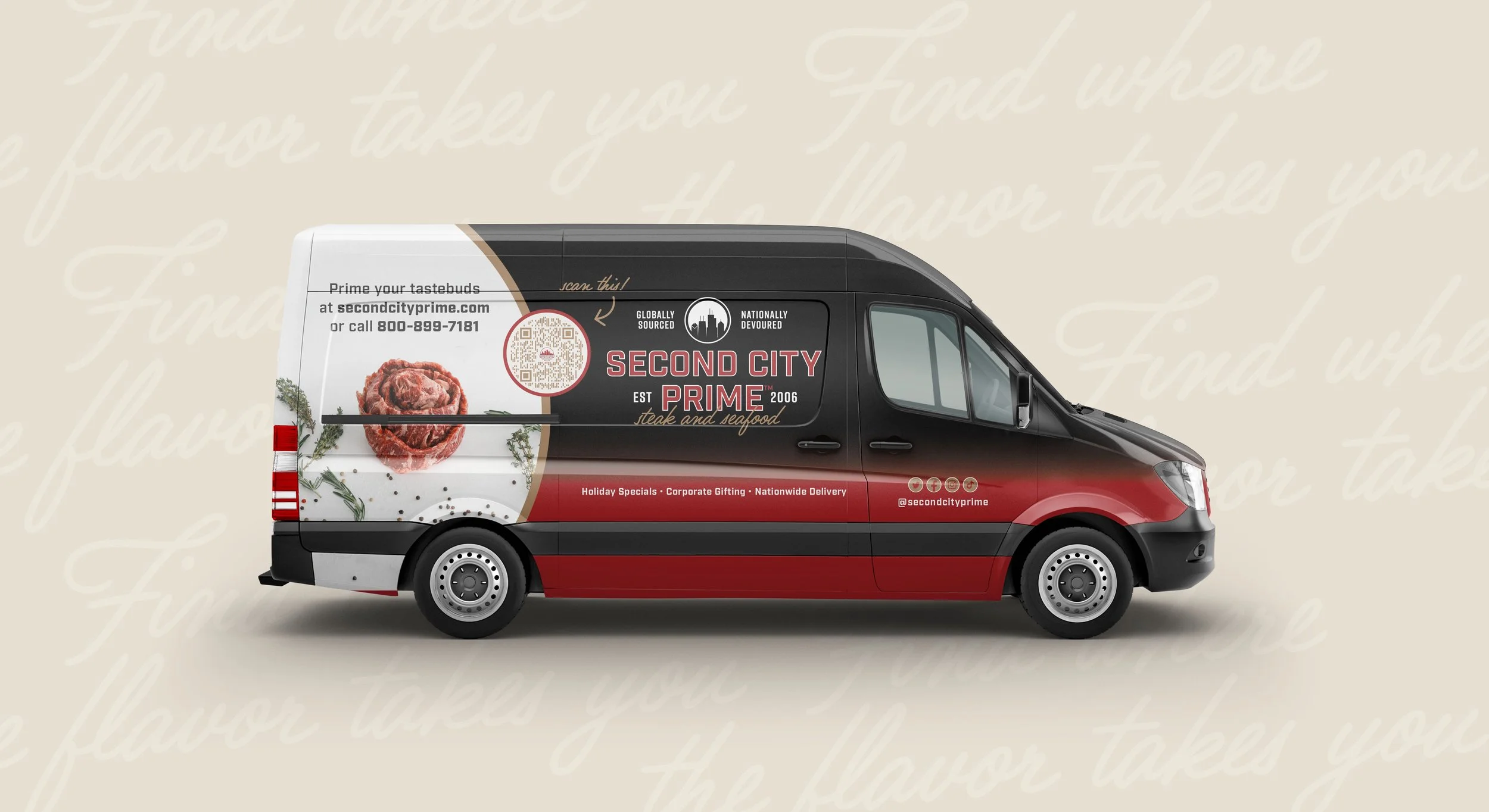
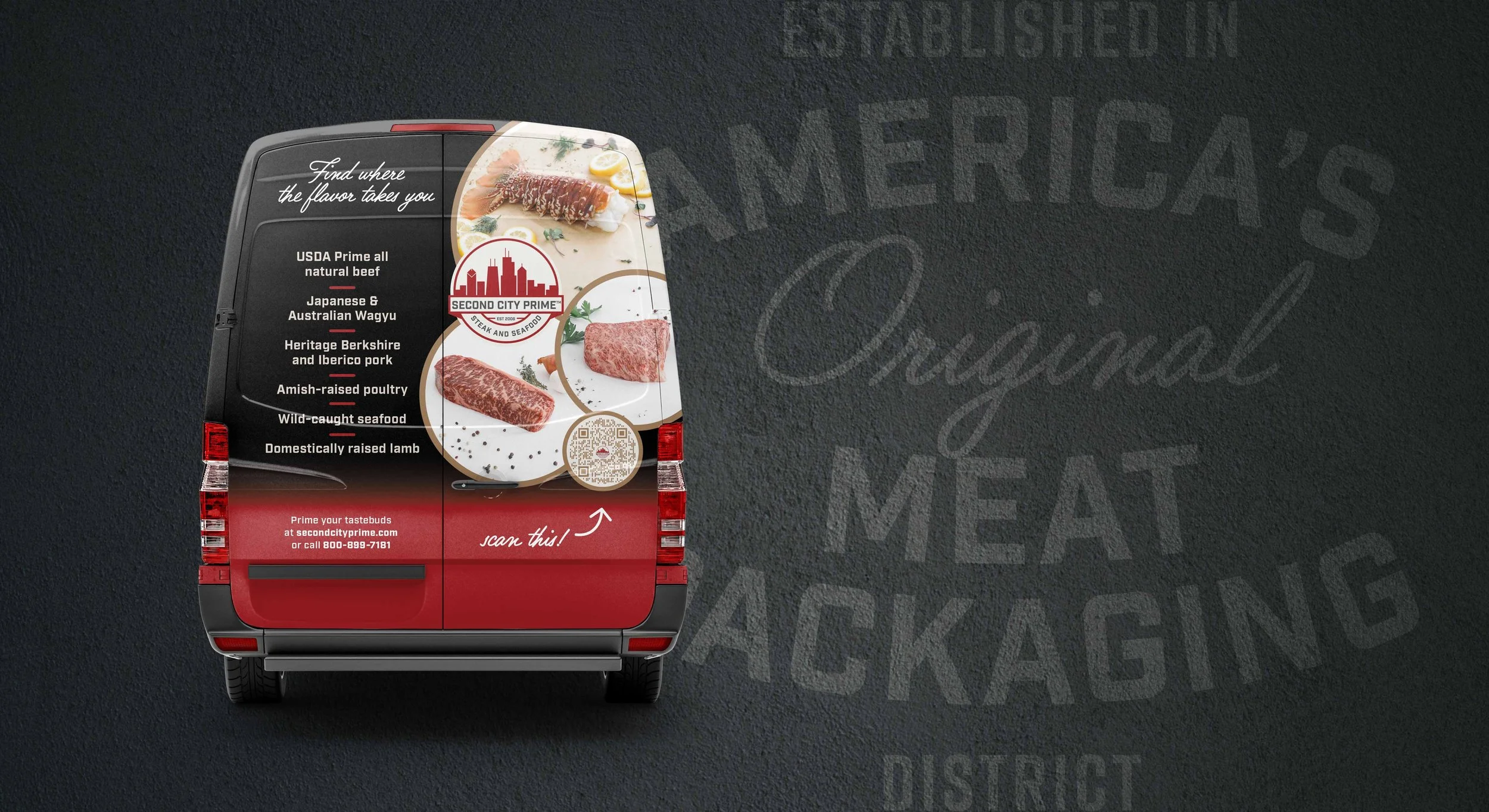
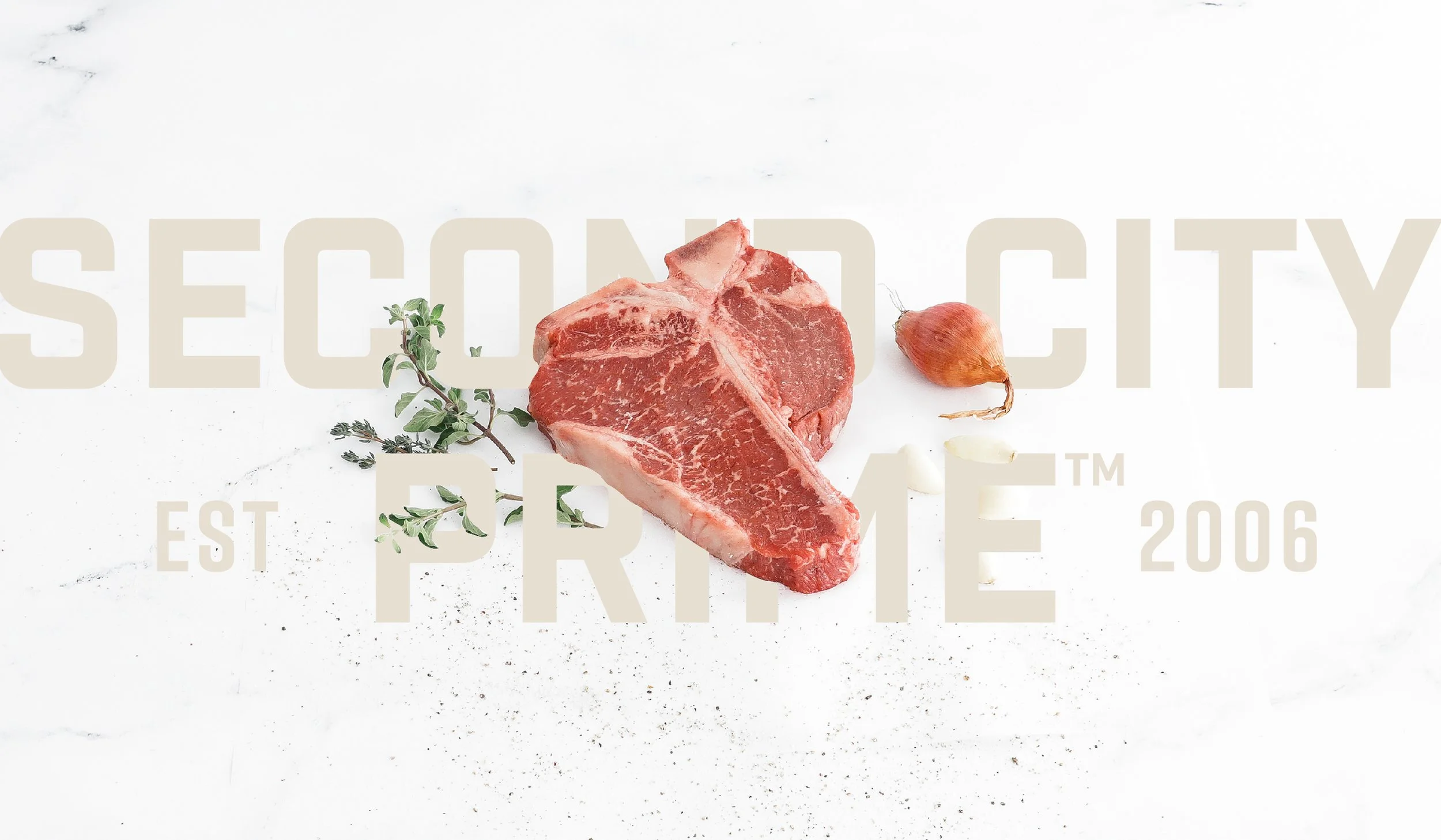
second city primeGlobally Sourced, Nationally Devoured
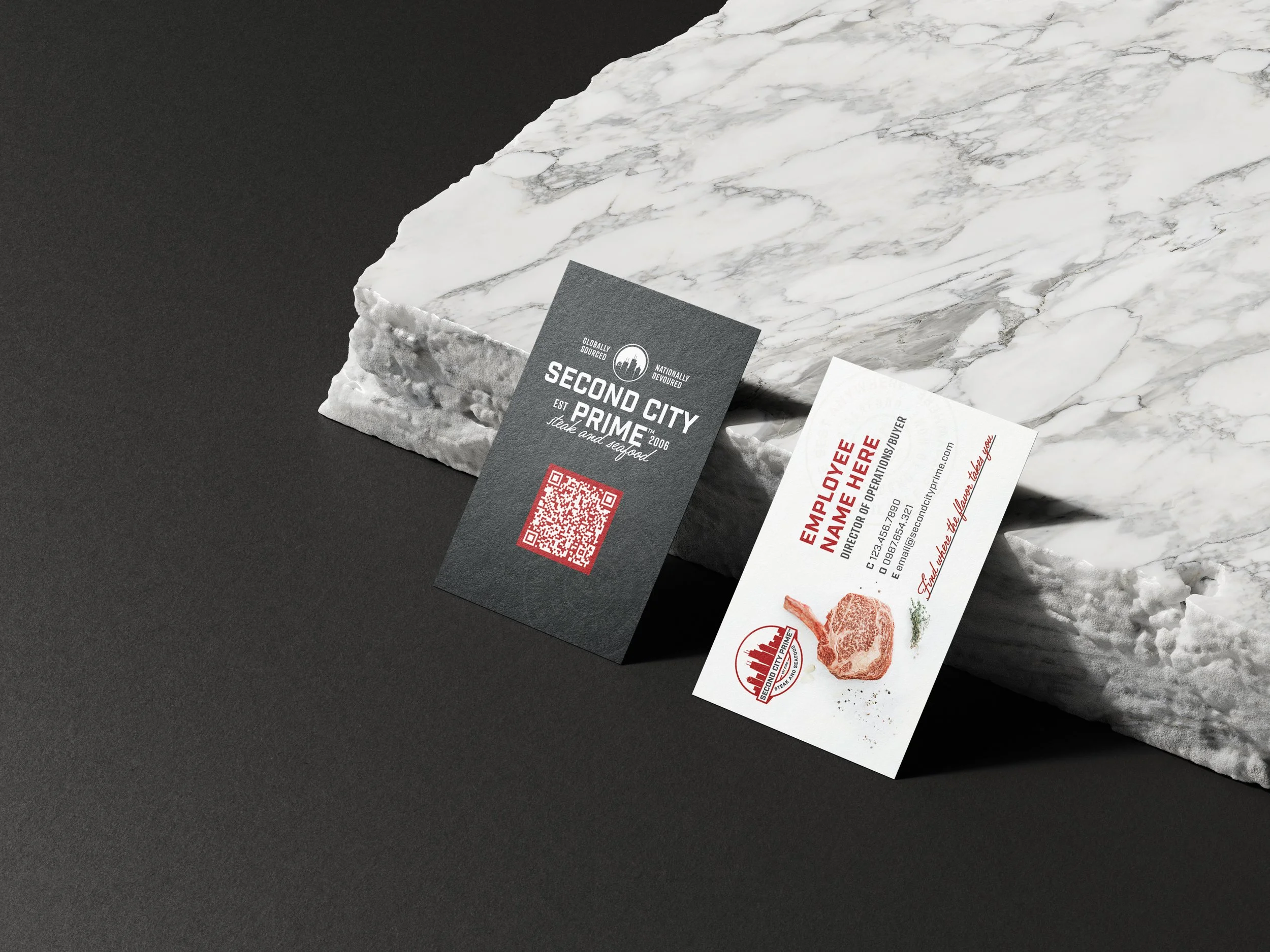
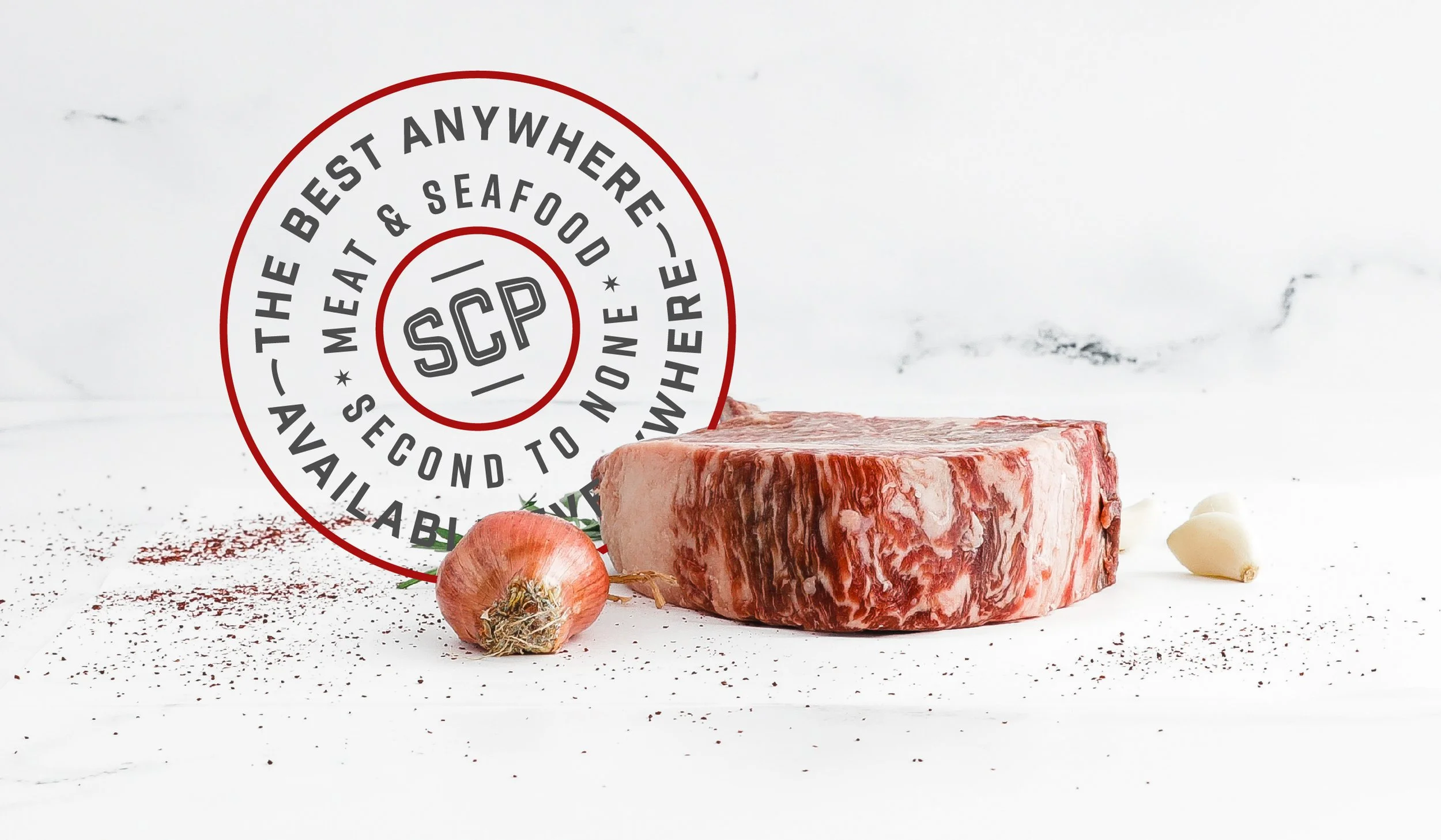
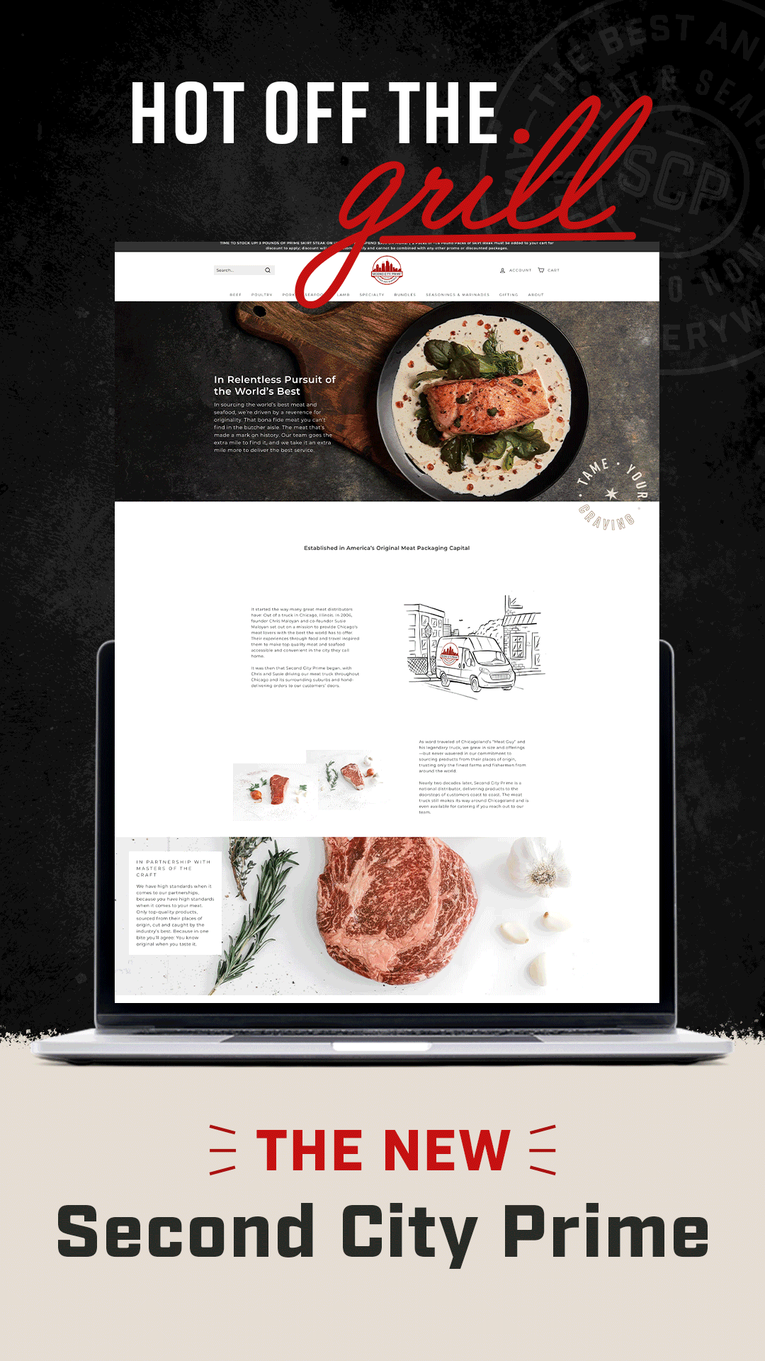
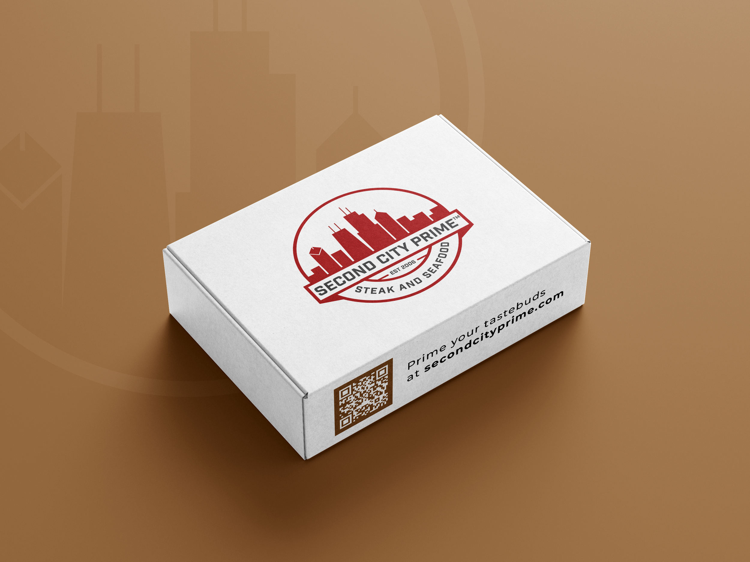
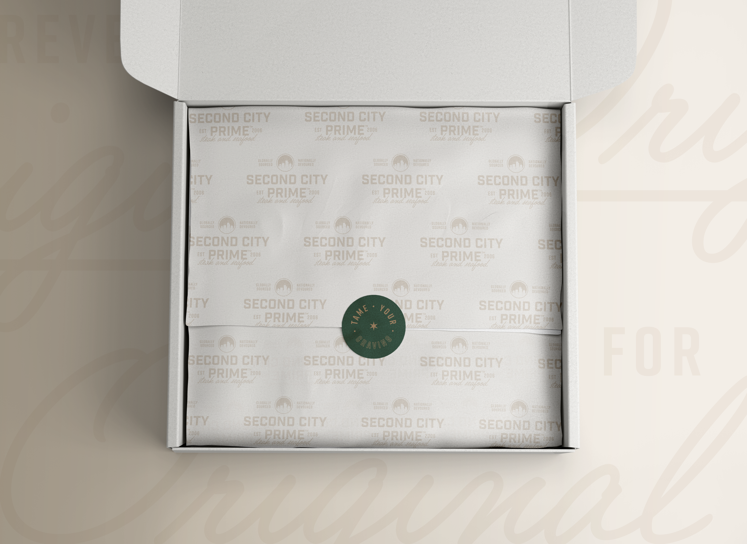
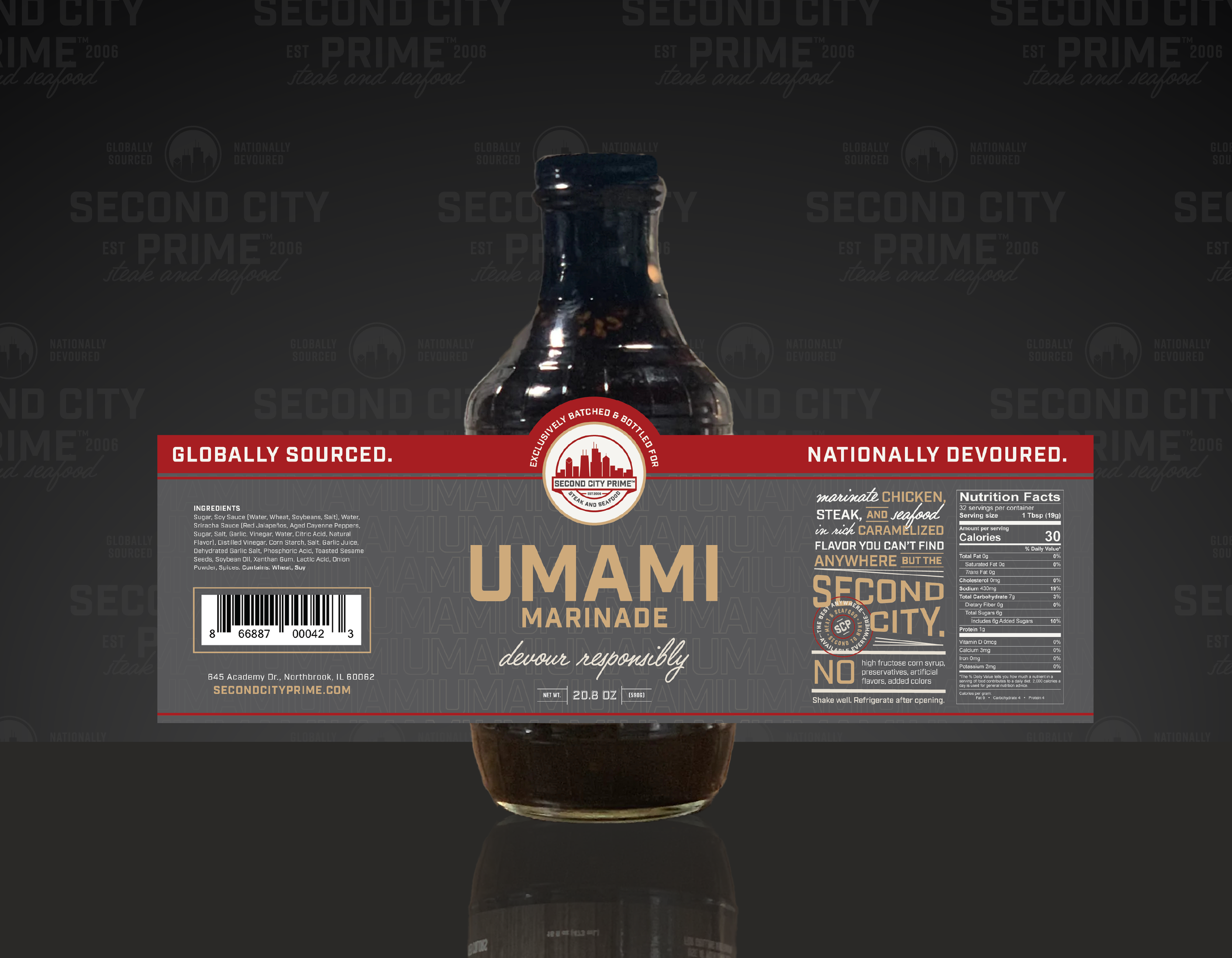
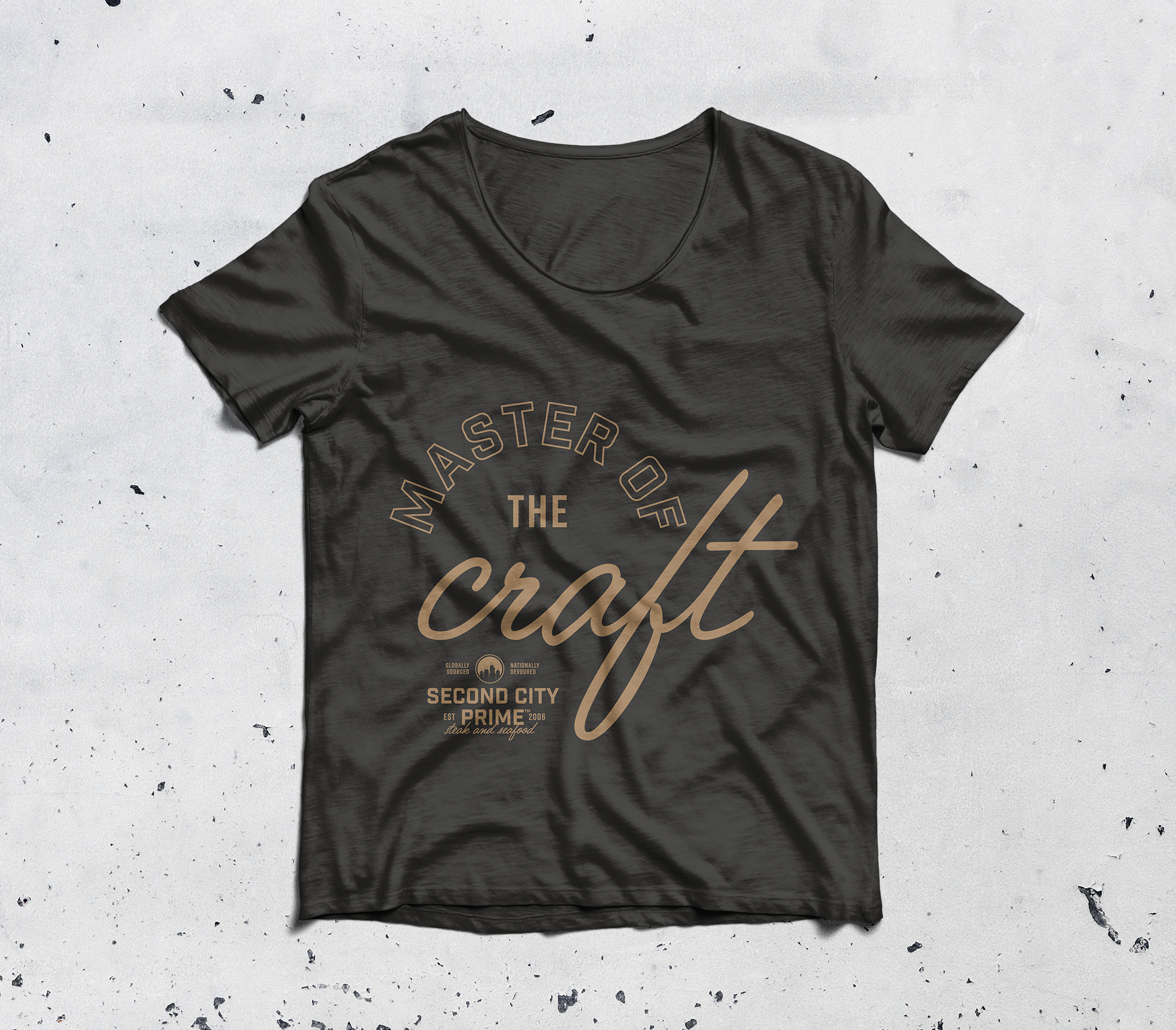
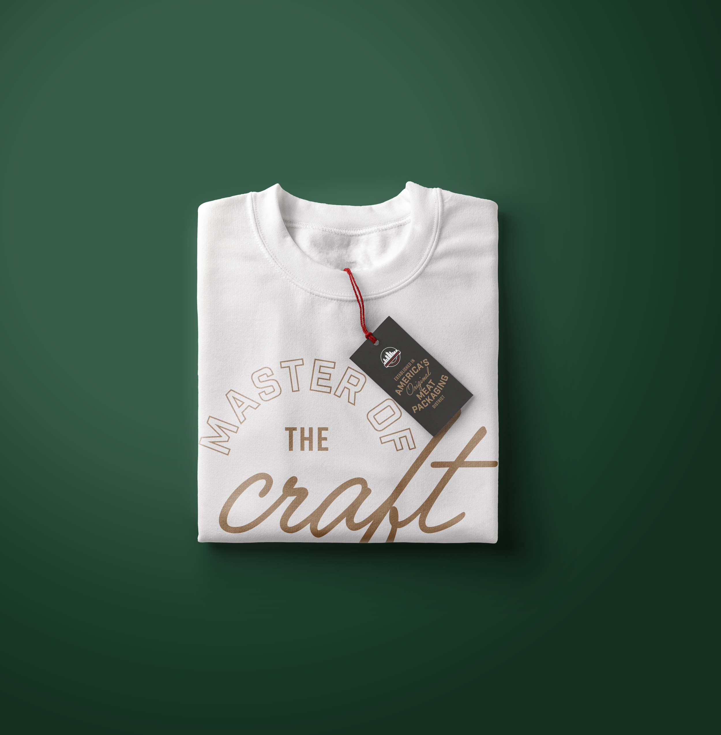
The rebrand for Second City Prime blends bold sophistication with a premium edge. The strong, modern typeface in the wordmark underscores the high quality of their steak and seafood, while the elegant script font introduces a touch of personalization, reflecting the exceptional customer service at the heart of the brand. This balance of boldness and warmth creates a distinctive visual identity that speaks to both the products’ excellence and the top-tier customer service at the heart of the brand, and beloved by its clientele.
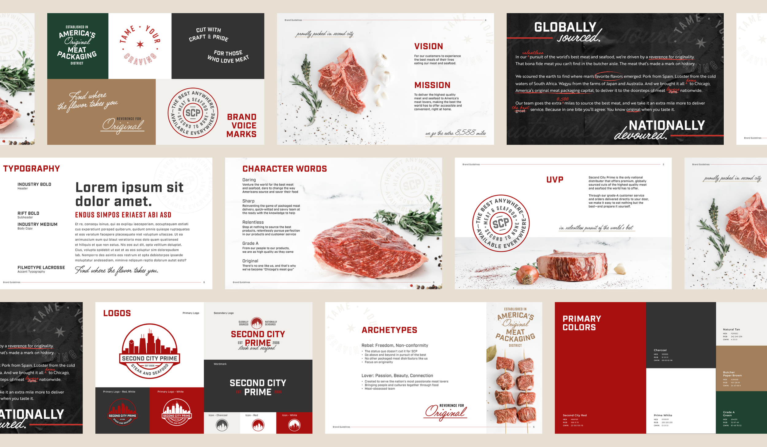
Areas of FocusArt Direction
Branding & Identity
Packaging
Lettering & Typography
Layout Design
UI Design
TeaMMaggie Curran, David Kail, Second City Prime, and their photography team